2024
CureValue
Figma Link

Background
Helping international patients connect with world-class healthcare in India.
CureValue is an AI-powered medical tourism platform designed to assist patients abroad in discovering trusted hospitals, personalized treatments, and streamlined travel plans—all within a single, user-friendly platform.
Core problem
Navigating healthcare in another country can be overwhelming. Patients face trust issues, unclear costs, and confusing travel logistics. CureValue needed a digital experience that felt secure, empathetic, and simple, while handling complex backend processes like treatment matching, visa help, and hospital coordination.
Design Process
1. Research & Discovery
Interviewed 8+ international patients and hospital coordinators
Identified key pain points: language barriers, trust, and lack of clarity
Mapped personas (solo patient, family rep, hospital partner)
2. UX Strategy
Defined a step-by-step onboarding and discovery journey
Prioritized clarity in communication—costs, treatment info, hospital ratings
Integrated “AI-suggested treatments” based on symptom input
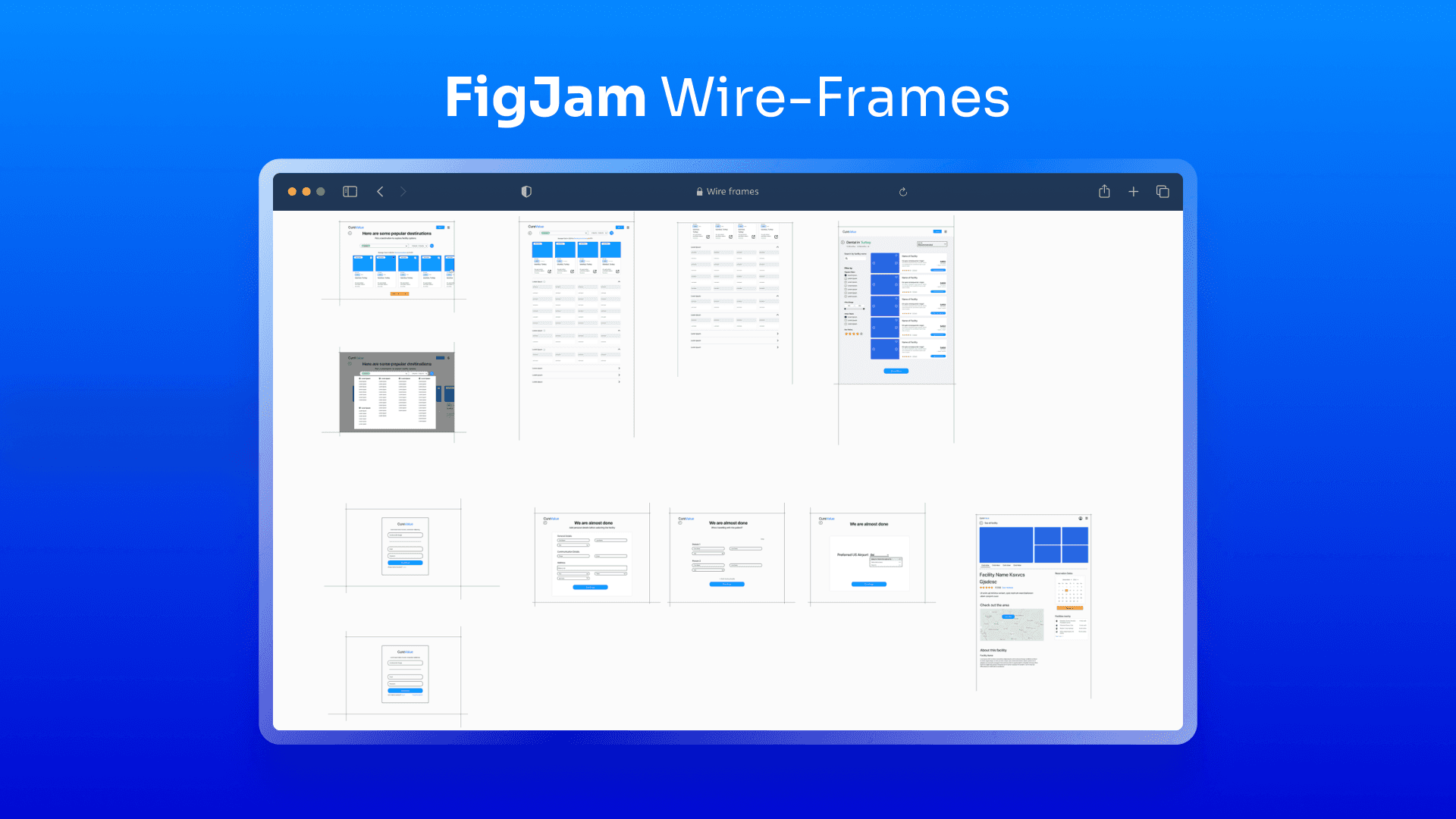
3. Wireframing
Designed wireframes for over 15 core screens (search, hospital profile, treatment planner, patient dashboard)
Tested wireframes with non-designers for clarity
4. Visual Design
Built a warm, reassuring UI using soft colors and large readable typography
Used familiar patterns to reduce learning curve
Included trust-building visuals like doctor ratings, testimonials, and badges
5. Prototype & Developer Handoff
Created interactive Figma prototypes
Documented every flow, state, and error case for engineering
Collaborated in sprints to review component implementation and responsiveness


Results and Impact
Impact & Results
Reduced user drop-off by 30% during treatment selection
Increased patient sign-ups in early testing via simplified onboarding
Improved trust scores through clear messaging and guided user paths
Platform praised by test users for "feeling human, not transactional"