2024 - 2025
Billy.com
Figma Link

Background
Billy.com is a professional service marketplace connecting users with vetted service providers in areas like home improvement, insurance, and legal services. Despite its broad service coverage, the platform struggled with high drop-off rates during critical stages of the service inquiry funnel. The challenge was to redesign the user journey to reduce friction, clarify messaging, and drive more qualified leads through the funnel.
Core problem
Users were dropping off during the service selection and inquiry flow due to a lack of clarity, excessive form inputs, and low perceived value. The design didn’t guide users effectively through the funnel stages, making conversion rates stagnant.
Design Process
1. Research & Funnel Diagnostics
Conducted user testing on the current funnel, identifying points of friction (e.g., unclear CTAs, overwhelming forms).
Analyzed session recordings and heatmaps to find abandonment patterns.
Compared funnel steps with industry benchmarks for service marketplaces.
2. Funnel Restructuring Strategy
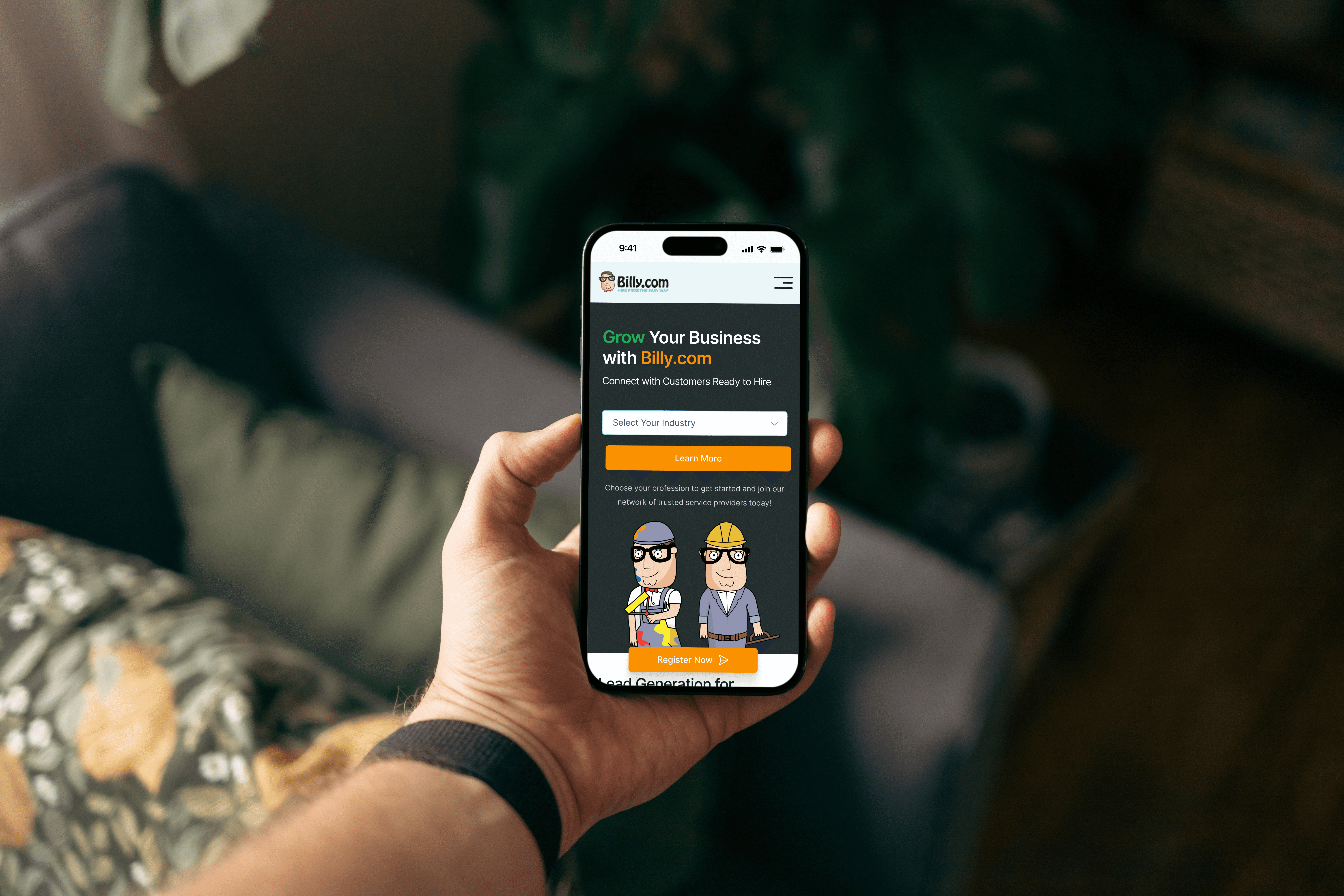
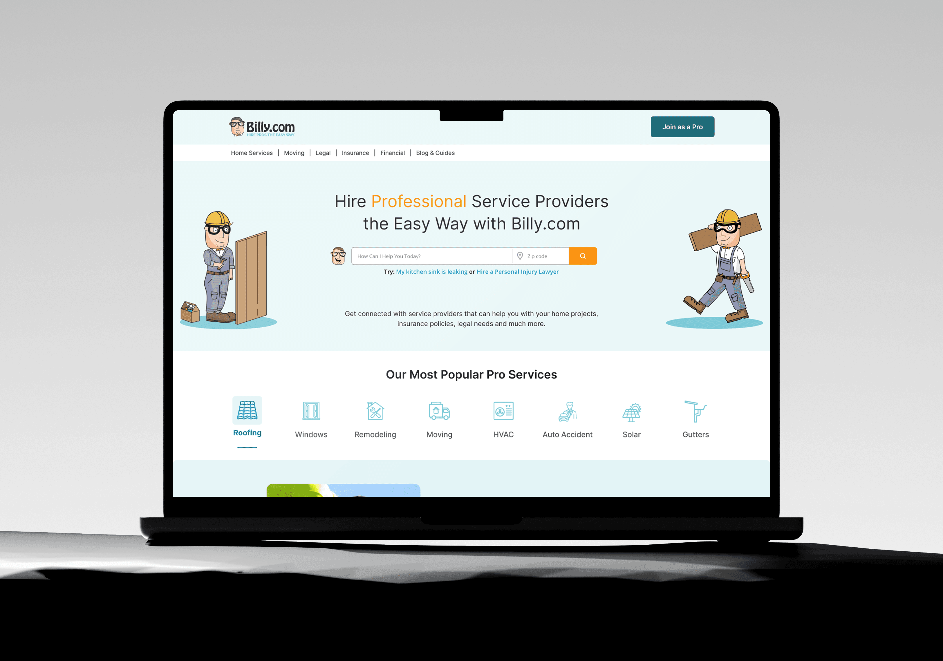
Entry Point Optimization: Redesigned landing pages with stronger value propositions and clearer CTAs to improve entry-to-action conversion.
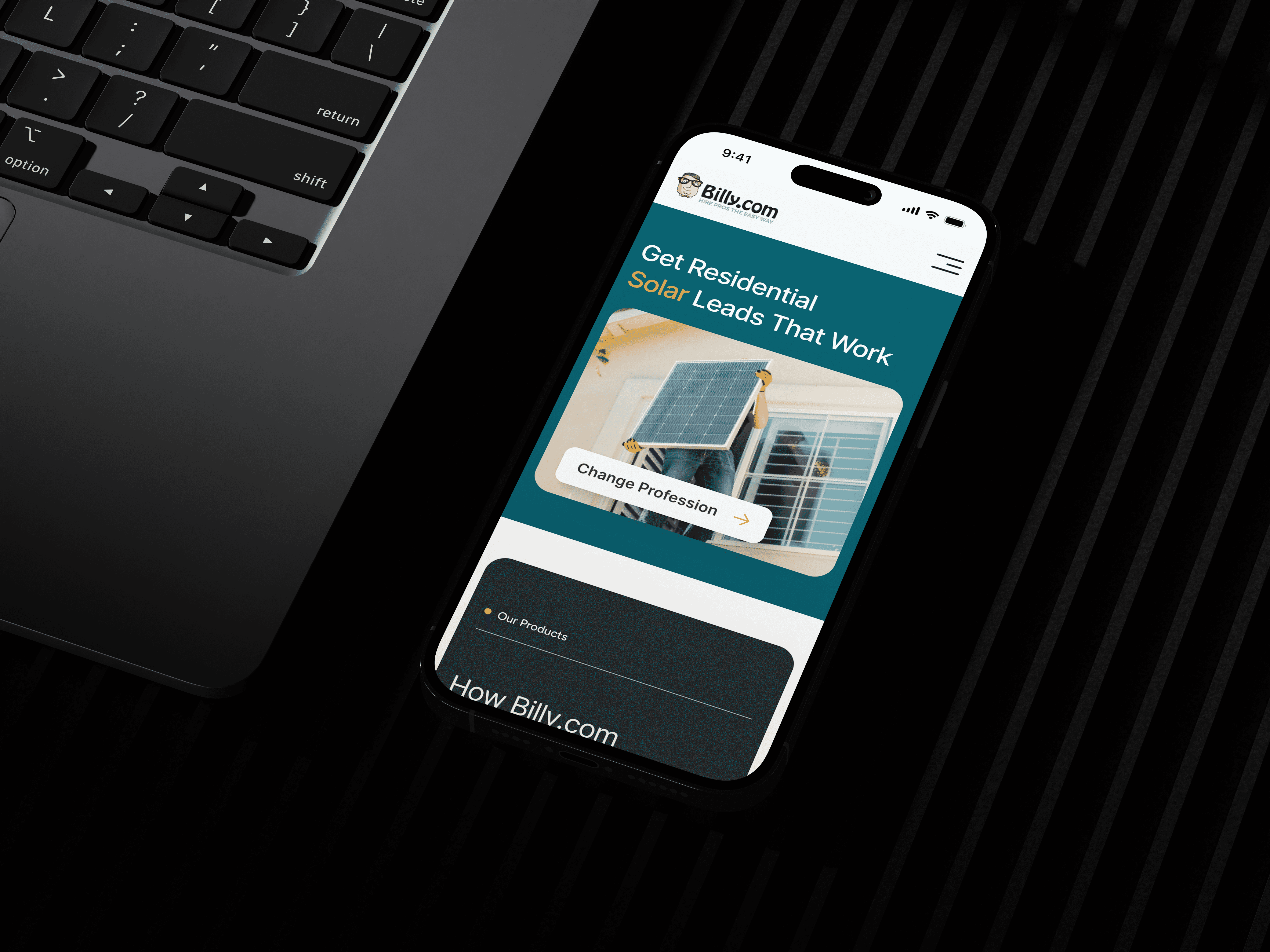
Progressive Disclosure: Broke long inquiry forms into digestible, multi-step flows to reduce cognitive load.
Trust Signals: Added testimonials, partner logos, and progress indicators to reduce hesitation during form completion.
Micro-interactions: Introduced subtle animations and confirmations to increase user confidence and momentum through each stage.
3. UX & UI Design
Created wireframes focusing on funnel logic, with particular attention to user motivation and friction points.
Developed high-fidelity mockups aligned with Billy's refreshed brand—clean, approachable, and trustworthy.
Prototyped and tested the revised funnel with real users, iterating based on feedback.
4. Developer Collaboration
Delivered annotated Figma files with interaction notes for precise implementation.
Participated in QA to ensure functional alignment with the funnel flow.
Provided responsive assets and design tokens for scalability.

Results and Impact
30% increase in funnel completion rate within the first quarter post-launch.
20% improvement in lead quality as a result of more intuitive inquiry forms.
Reduced drop-offs by simplifying key friction points (especially on mobile).
Improved user satisfaction and engagement metrics across the board.